Colors That Help You Sleep Better: 5 Soothing Shades for Deeper Rest

Introduction
Have you ever noticed that some rooms instantly make you feel calm and ready to sleep, while others seem to keep you wide awake?
Its not just your imagination the colors that surround you have a powerful impact on your mood, body, and quality of sleep.
In this article, well explore five colors that can help you fall asleep more easily and rest more deeply, plus simple tips on how to bring these shades into your bedroom or relaxation space.
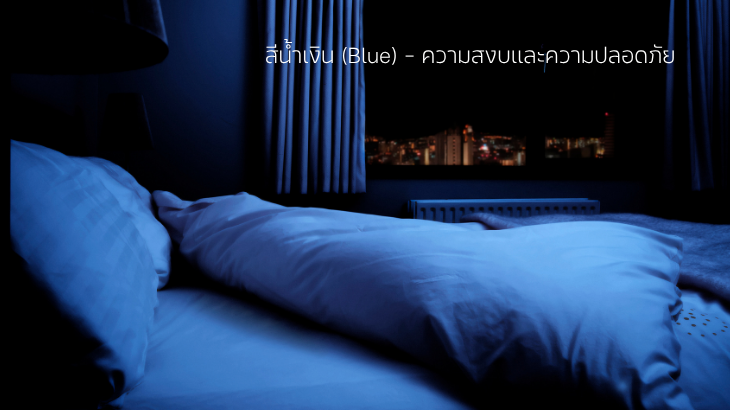
1. Blue Calm and Safe
Research in color psychology shows that blue tones can help lower heart rate and blood pressure, signaling the body to relax. Thats why blue is often considered the most sleep-friendly color for bedrooms.
Tip: Choose calming shades like navy blue or soft pastel blue instead of bright, electric blue to create a gentle atmosphere.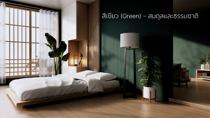
2. Green Balance and Renewal
Green is the color our eyes find easiest to process, making it naturally restful. It symbolizes balance, renewal, and the soothing energy of nature.
A bedroom with green tones can reduce stress and create a sense of grounded calm.
Tip: Add a small plant or bedding in soft green tones to bring a touch of nature indoors.
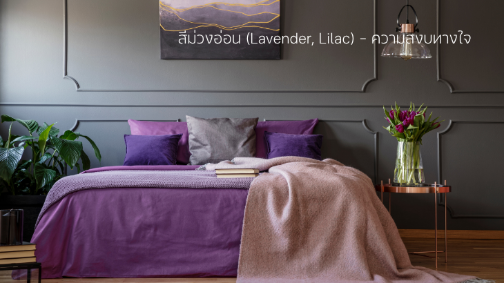
3. Lavender Gentle Peace of Mind
While dark purple can feel luxurious and mysterious, lighter shades like lavender or lilac bring softness and tranquility.
For centuries, lavender has been associated with calmness and better sleep, often paired with the scent of lavender oil.
Tip: Try lavender-colored pillowcases or throws, and pair them with a calming essential oil for maximum effect.
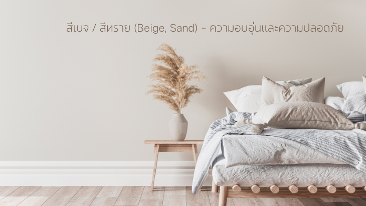
4. Beige / Sand Warmth and Comfort
Neutral tones like beige and sandy hues create a warm, safe, and cozy feeling perfect for winding down after a busy day.
These earthy colors make a space feel homelike and inviting, without overwhelming the senses.
Tip: If repainting walls feels like too much, use sand-colored rugs, bedding, or cushions to soften the atmosphere.
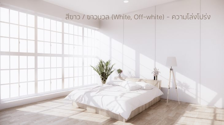
5. White / Off-White Clean and Spacious
White opens up a room, making it feel airy, clean, and uncluttered. But pure, stark white can sometimes feel cold or sterile.
Thats why off-white or ivory tones are better choices for sleep spaces they bring warmth while keeping the room bright.
Tip: Pair off-white walls with natural wood accents to balance freshness with warmth.
Colors to Avoid in the Bedroom
Bright Red Stimulates energy, raises heart rate, and keeps the mind alert.
Deep Orange Can feel too intense, sometimes triggering restlessness.
Solid Black May feel heavy or overwhelming if overused.
Conclusion
Choosing the right color for your bedroom (or any relaxation corner) isnt just about style its about creating an environment where your body and mind feel safe enough to truly rest.
If youre seeking deeper, more restorative sleep, try shifting your surroundings toward softer, calming hues like blue, green, lavender, beige, or off-white.
And its not just bedrooms. Even the tools you use daily like your yoga mat can influence how calm and centered you feel.
Explore our yoga mats in Navy, Green, and Sand to create a space that brings you both focus during practice and tranquility for restful nights.


